I have been a huge fan of Patrick Rhone’s Minimal Mac, ever since he launched the tumblelog a few days back. The content that is published there is truly impressive and inspiring. A couple of days back, Patrick happened to post a picture of Shawn‘s Desk and his Desktop. But it was his Dock that really caught my attention. It was one of the simplest Dock I’ve seen so far, but it was in no way lacking the functionality offered by the conventional Docks you see on most Desktop screenshots with a billion icons in them.
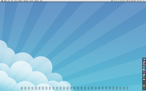
With all the minimalist gyaan in my head, I decided to redo my Desktop and here’s what I ended up with:
Now, everyone has their own way of looking at things, and this simplistic, minimal approach may not appeal to you, but I’ve observed that this has made me so much more productive. I’m very particular when it comes to clutter on my Desk and I always usually keep is clutter free. After completely changing the look of the blog as you can see, transforming my Desktop into a clutter-free environment was the obvious next step in evolution and was to happen sometime soon.
Here’s what has been done to the Desktop:
Wallpaper
I’m pretty sure a ton of people are going to ask for the source of the wallpaper, but sadly, I do not remember it. I think it was somewhere on DeviantArt.
//Update: The Wallpaper is from here. Thanks David.
No Icons on the Desktop
While there are apps out there that let you simply hide the icons on your Desktop &mdash such as Deskshade or Camouflage, I decided to do it manually. After moving every file on my desktop (I had about 30 of those) into neatly categorized folders in my user directory, I simply turned off the drive icons in Finder’s preferences.
Finder's Preferences to Hide Drive Icons on the Desktop
Dock
As you may have noticed, the Dock isn’t simply positioned to the right of the screen, it is at the bottom right. Thanks to Shawn again for this excellent tip. Executing the following two commands at the Terminal:
defaults write com.apple.dock pinning -string end
killall Dock
LaunchBox
Launch What?
Just like a DropBox is a box to drop your stuff into, I have set-up a LaunchBox in my Dock to launch stuff that I most frequently use. The permanent icons in my Dock are of the apps that are running almost always running. Other, less frequently used apps such as Coda, MarsEdit, Photoshop etc. are available from the LaunchBox List when required. Everything else is just a Spotlight away.
The LaunchBox is a folder in my user directory that contains aliases for all those apps. By making this folder available from the Dock, I have access to any of these apps without wasting any space in the Dock or waiting for Spotlight to launch them. This is by far the best tip for the Mac and I’m surprised I didn’t come up with it earlier.
I’m very happy with this current set up and I don’t think I’m making any modifications in the near future. You can take a look a some of my previous Desktop styles on Ember.
What’s your Desktop like?
